In 2001, the North American Vexillological Association (NAVA) asked visitors of its website to give their opinion on 72 sub national and territorial flags of the United States and Canada. 100 NAVA members and over 300 non-members ranked the 72 flags on a scale of 0 to 10 (worst to best).
You’ll notice that all of the flags below have two things in common: a blue background and a complex seal. After their survey NAVA stated that about half of U.S. states used blue fields and complex seals, making it difficult to distinguish many flags between each other.
Thus, here’s our objective list of the five ugliest sub national and territorial flags of the U.S. and Canada.
5. South Dakota
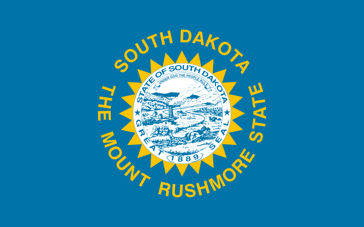
South Dakota designed their current and previous flag designs on the area’s common weather pattern: sun and light blue skies. Though only the fifth ugliest U.S. flag, it has been harshly criticized for an unnecessary repetition of the state name on both the outside and inside the seal. South Dakota’s original flag of 1909 was much more simple, consisting of a dominant yellow sun encircled by the text "South Dakota" and "The Sunshine State." South Dakota would have kept that design, they would have ranked much better in the NAVA survey.
4. Kansas
The flag of the state of Kansas was adopted in 1927. The elements of the state flag include the state seal and a sunflower. This original design was modified in 1961 to add the name of the state at the bottom of the flag.
Take a look at our 3D, reclaimed wood version of the Kansas Flag. It’d look great (or ugly) in your home. Interested? Learn more!
3. Montana

Voted the third ugliest U.S. state flag, the flag of Montana seal features a plow, shovel, and pickaxe in a field in front of the Great Falls of the Missouri River. The ribbon near the bottom of the ensign contains the state motto, "Oro y plata," which is Spanish for "Gold and silver." This version has been in use since 1905. The only difference between the current version and the previous version is the word, “Montana.”
2. Nebraska
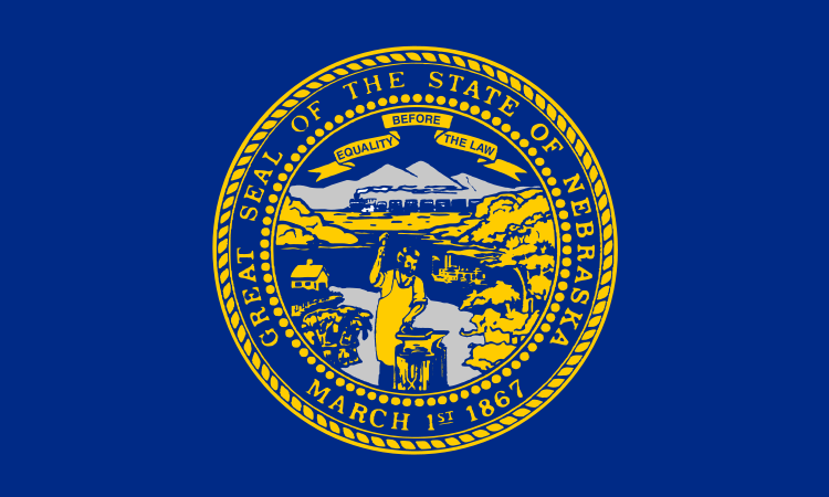
The current design was adopted in 1925. And though an official designation of the state flag occurred in 1963, Nebraska was still one of the last states to adopt an official flag.
Even though the Nebraska Legislature's Government, Military, and Veterans Affairs Committee discussed a bill in 2002 that would have allowed a redesign, the flag was never updated making it the second ugliest U.S. state flag.
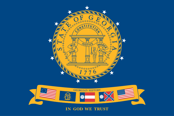
1. Georgia
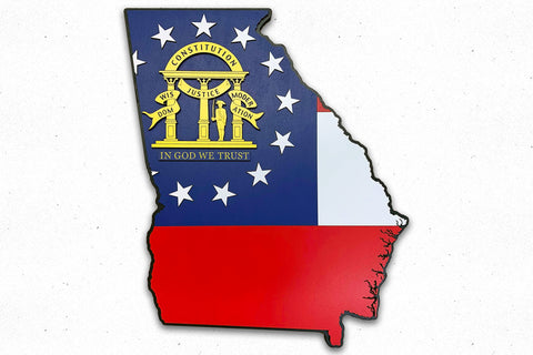
There you have it! The ugliest U.S. state flag goes to Georgia. Since they were established in 1854, the state flag has been through eight design iterations. The edition above was in use from 2001 until 2003 when they adopted a completely new flag.
Here at Patriot Wood, we build a fantastic 3D rendition of newest Georgia flag that’s been in use since 2003. Don’t worry, it’s quite beautiful. Go ahead and take a look!


